We are
Coming Back
Soon!!
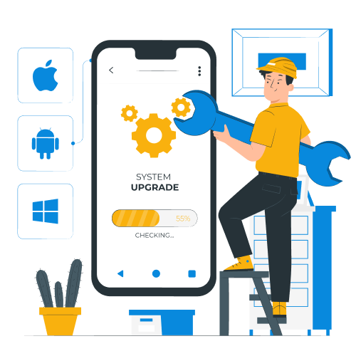
Get ready we have something coming that is going to blow you away. Below is a sneak peek of what we offer. Check back often for our launch.
- Web Development
- Mobile App Development
- Web-App Development (PWA)
- Ui/UX Designing
- Go To Market Planning